Visual content plays a vital role in marketing — a fact that marketing professionals know well. Around half of those surveyed by Venngage described visual content as ”very important.”
But there’s a problem.
Creating high-quality visuals is a challenge for most content teams. According to the same Venngage study, marketers rate the difficulty at 7 out of 10 on average.
To make things even more challenging, the demand for visual content has exploded as content teams work to keep up with new channels and formats.
LinkedIn, Instagram, blogs, events, webinars, emails — they all need visuals.
Our client, DreamHost, knows the challenge well. Along with a blog, their marketing team handles six social accounts, covering two different languages. And those channels all need content.
But there isn’t enough bandwidth and budget to create bespoke visuals for every context.
So, each month, we create around 48 images and 12 motion graphics to power 72 posts across seven different channels (including two Spanish-language channels).
Let’s unpack what the process looks like.
Implementing the Optimist Approach to Visual Content
To help our clients stay ahead of the curve, we’ve developed a unique approach to creating visual content at Optimist.
Here’s how we approached the task of building visuals for one DreamHost blog post:
Step 1: Identifying Opportunities
The best visual content matches the needs of the audience.
In this example, the post was about email design. The target audience of small business owners wants to pick up the core principles of good email design quickly. So, the main purpose here was education.
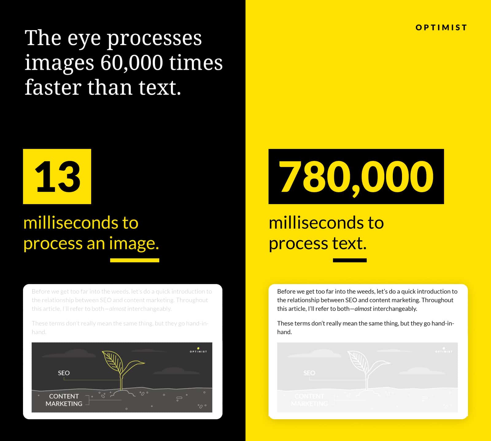
You can convey information through an image in just 13 milliseconds. That’s 60,000 times faster than with text. For this reason, we usually begin by analyzing the draft post from the writer to find tricky concepts that could be illustrated.
We look for things like:
- Abstract ideas: Some concepts are difficult to grasp at first pass. A good illustration can help the audience gain a better understanding.
- Spatial concepts: Certain ideas are based on physical layouts. When explaining such concepts, it’s much easier to show than to tell.
- Processes or workflows: Showing multiple steps or actions in a visual flow allows the audience to see the individual components and the overall picture.
- Comparisons: Seeing two options side by side makes it easier to compare the differences and similarities.
For this piece on email design, we identified a section that explained the benefits of designing with a single column versus multiple columns.
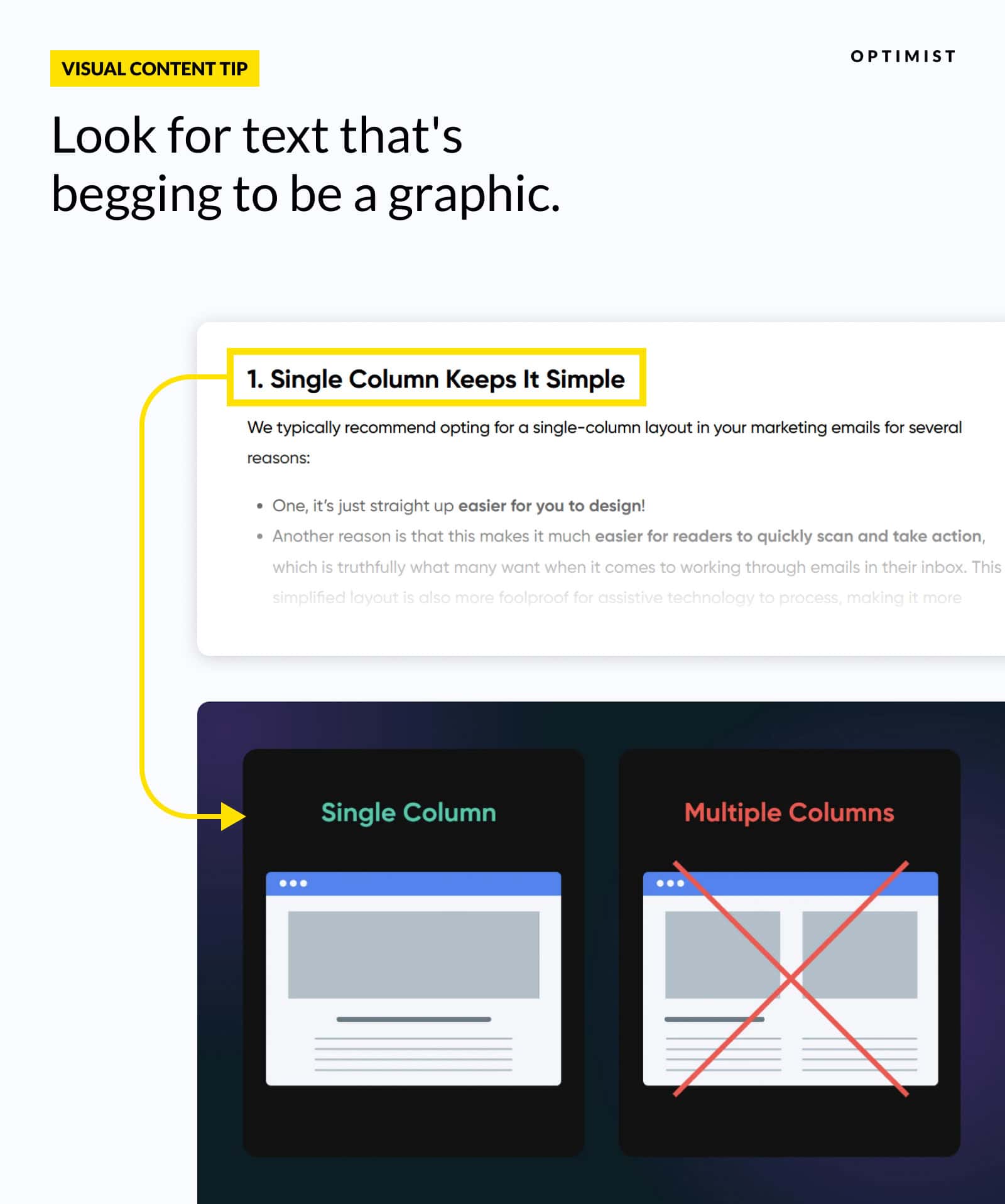
This was a chance to create a clear visual comparison, demonstrating how a single column is more compelling. Opportunity noted.
Next, we focused on a section that introduced the concept of the “F-Pattern” in user behavior.
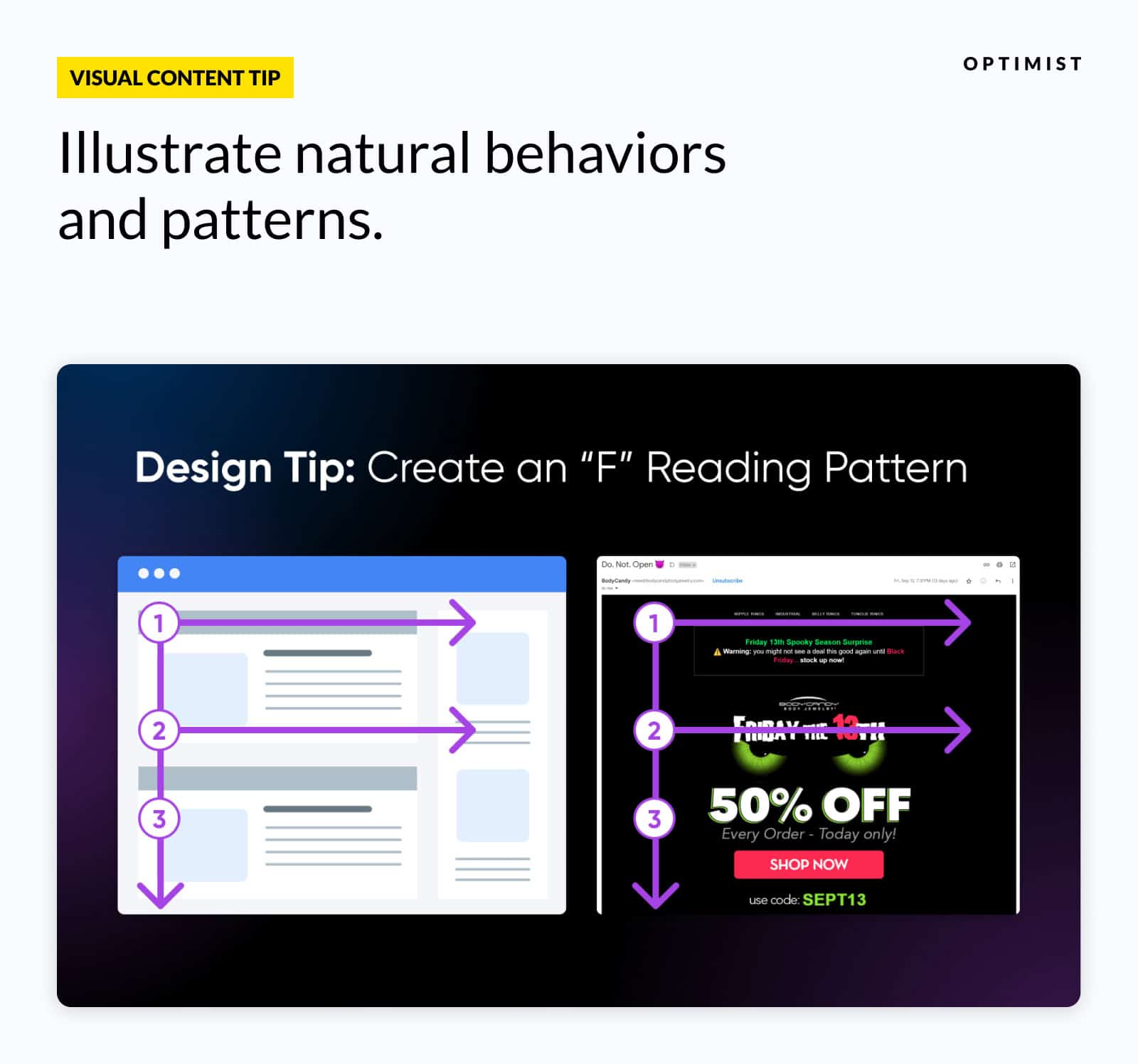
This is a classic example of a concept that’s best explained visually. Another addition to our list. Check.
We also noticed this section, describing the importance of using hierarchy within email designs.
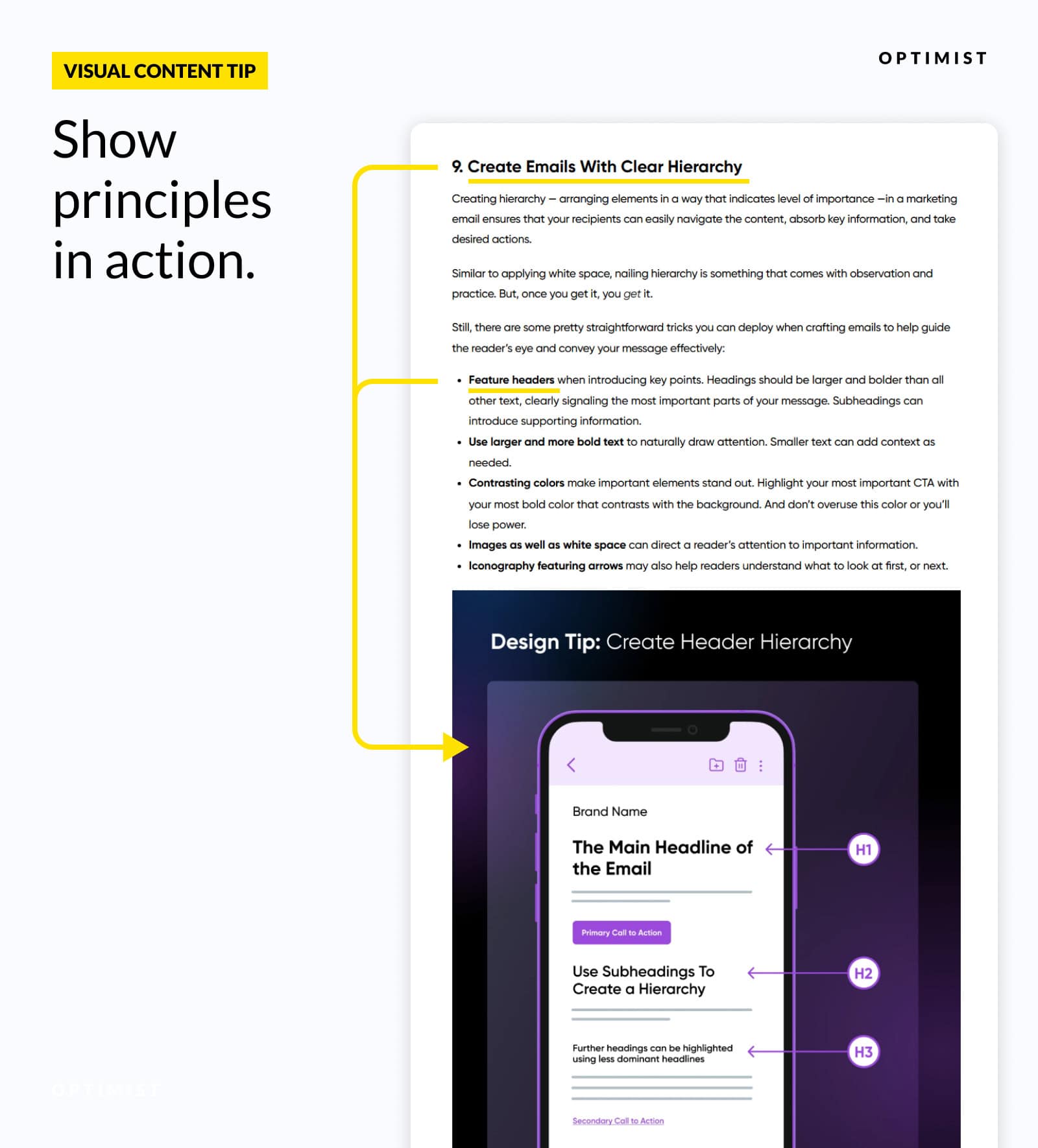
It’s fine to describe what hierarchy means. But ultimately, it’s a visual concept that’s best explained through pictures rather than words.
As a general rule, we try to identify visual opportunities about every 400 words within written content.
Just as importantly, we aim to create visuals that both add value to the post, and work as standalone assets that can be shared on social and other distribution channels.
Here, we found 10 opportunities to convert written concepts into visual content. Enough to engage readers — without overwhelming them.
Step 2: Developing Visual Ideas
The next step is to develop content ideas for each of the opportunities we identified.
We don’t aim to produce a final design output at this stage. It’s about figuring out how to translate written information into visual content.
The process usually involves sketching — conceptually or literally — how we want the final design to look. It’s similar to crafting an outline before you begin writing an article.
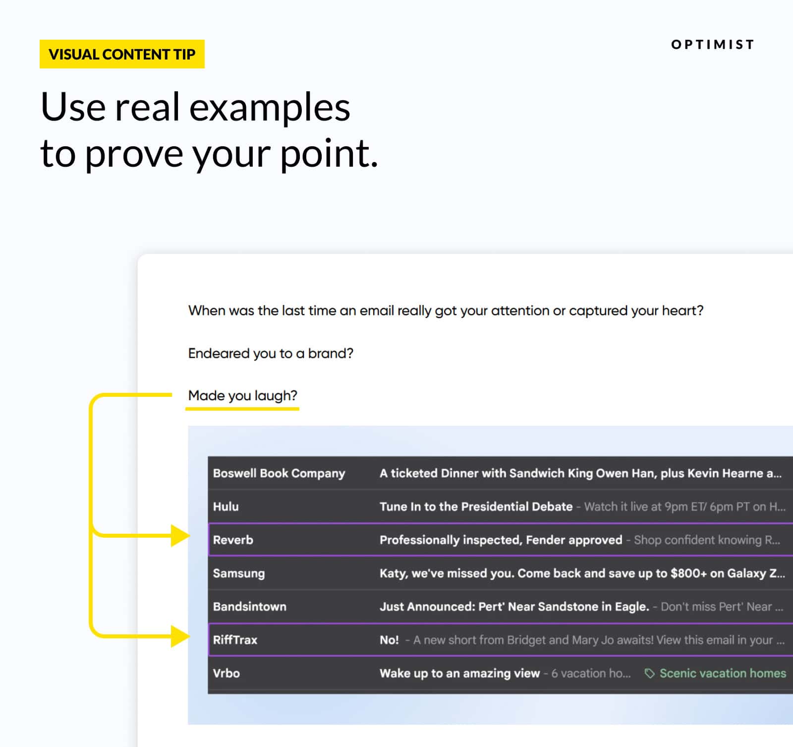
Sometimes, this work is straightforward. In the DreamHost post, we wanted to show examples of attention-grabbing subject lines; the obvious choice was to take a screenshot of an email inbox.
But some ideas require more thought.
How do you quickly convey design principles to an audience with no creative background? In the DreamHost post, we decided to use simple visual comparisons to help readers understand the benefits of various layouts, fonts, and color choices.
We also chose to include plenty of screenshots, so readers could see those principles in action.
When deciding which type of content to create, we generally follow these guidelines:
- Simplifying a complex idea or process? Use a diagram to make the concept easier to visualize.
- Showing real-world execution? That’s where a screenshot or photograph works best. People want to see the theory applied to real life.
- Presenting data? A chart or graph can help the audience interpret the numbers.
- Making a comparison? Using a side-by-side layout allows readers to weigh up the options and draw their own conclusions.
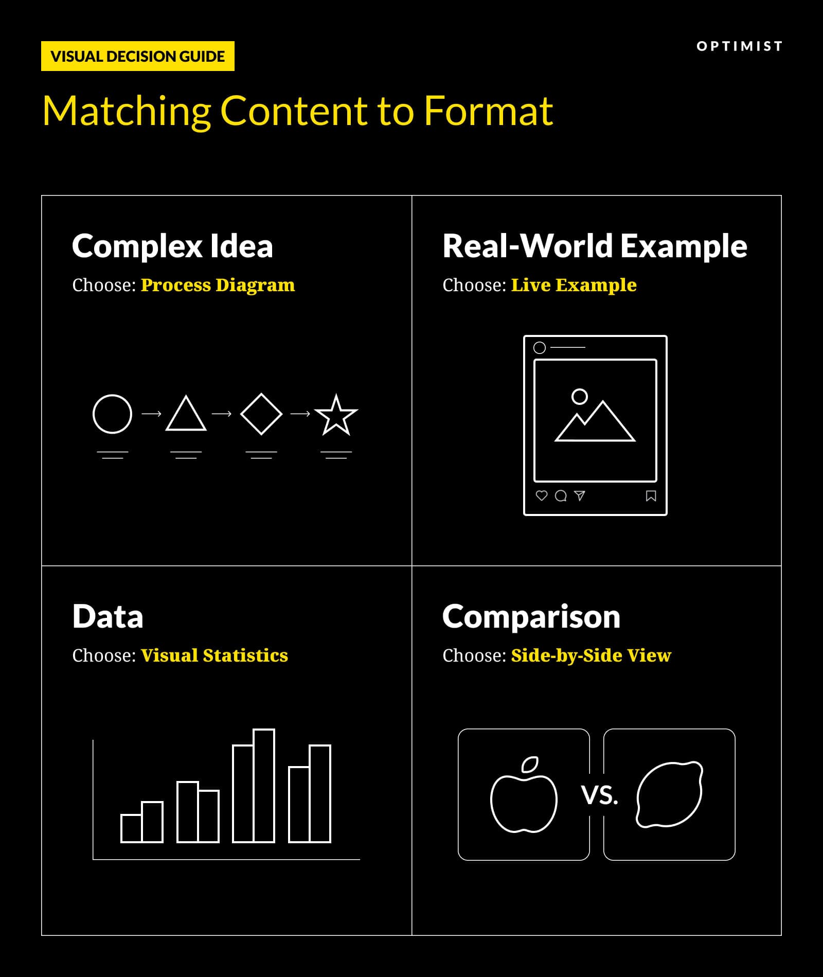
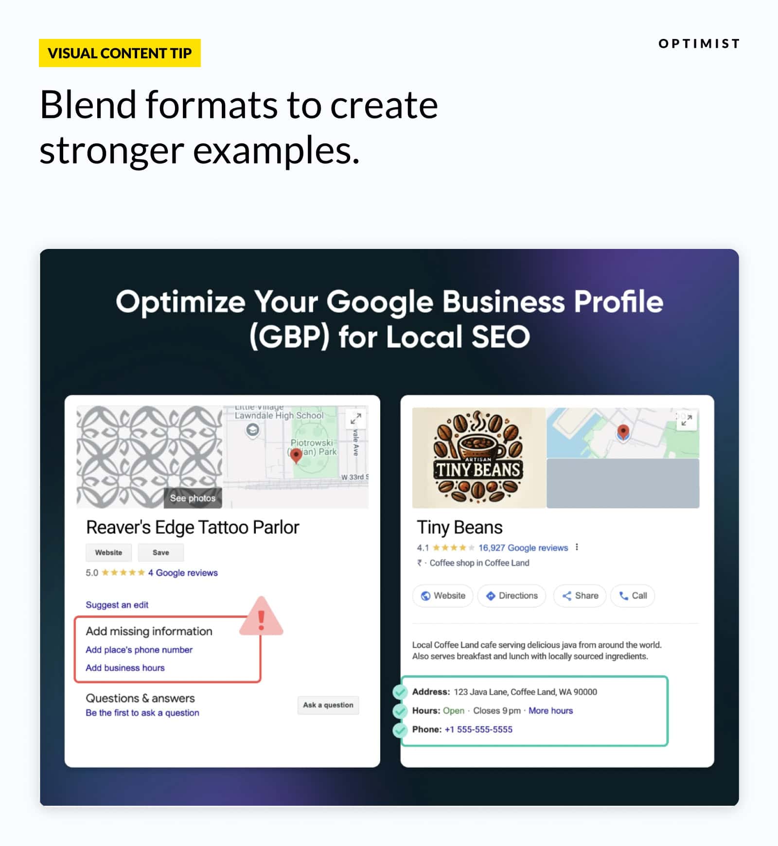
Some situations call for blending two or more of these approaches for maximum impact. You might combine a side-by-side comparison with real-world screenshots to help readers evaluate actual implementations of different solutions.
You’ll see the example below combines a side-by-side comparison with real-world examples. We used the familiar Google Business Profile interface but created fictional businesses to illustrate the contrast between an incomplete and optimized profile.
This approach lets us show SEO best practices while protecting the privacy of actual small businesses.
Once again, it’s about matching the content to the aims of the audience.
What if You’re Stuck for Design Ideas?
At Optimist, we often produce content for clients in topical clusters. This means publishing many articles that revolve around roughly the same topic or product features.
So, it’s easy to start running out of ideas. Take financial metrics and KPIs, for instance. There are only so many ways to illustrate formulas and calculations before things start feeling repetitive.
Example: We worked on a piece for Stampli — a financial operations platform centered on automation — about procurement KPIs that included several formulas and metrics.
In the section on PO aging, rather than showing another formula, we created a visual timeline that showed how purchase orders progress through different aging stages:
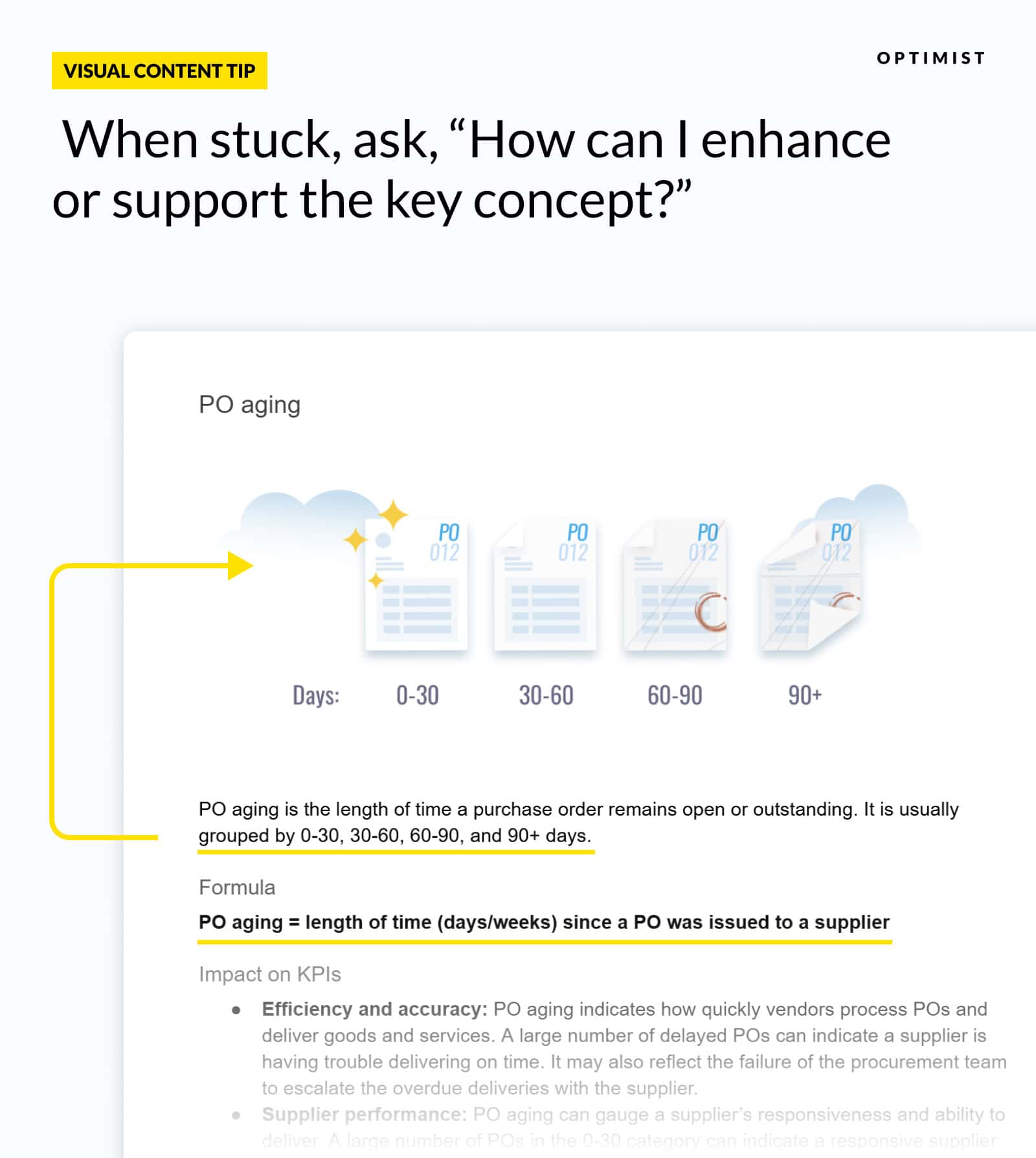
Even though the key concept here is the PO aging formula, this visualization helps readers quickly grasp the concept of PO aging periods to better understand the importance of this formula.
More engaging than another formula or slapping in a pull quote, right?
Integrating AI
Most of these ideas come from two sources: Our visual coordinators and our writers. But more recently, artificial intelligence has become a powerful assistant to our ideation team.
At Optimist, we believe AI has a place in the visual content workflow — not as a lazy shortcut, but as a jumping-off point for human creativity.
It can also assist design teams with:
- Automating repetitive tasks: Resizing images, setting up templates, and checking images for branding consistency.
- Faster image editing: Tools like Adobe’s Generative Fill can help designers produce polished graphics faster.
- Creating individual assets: While fully AI-generated images are rarely ready to publish, they can prove useful as components within designs.
Conversely, we believe relying on AI to produce publish-ready graphics is a bad idea.
The images produced by current models might be impressive, but they come with issues:
- They often include weird artifacts that are easy to miss.
- Most AI imagery has an identifiable look that feels inauthentic.
- They’re really hard to modify, meaning you can’t easily recycle them.
- No matter how much context you provide, AI models can’t truly understand the intent of your brand in the way a human designer can.
Who knows how this will change in the years to come? But right now, the graphic design and data visualization we produce for clients is out of reach for AI tools.
Step 3: Communicating With Designers
To make sure the concepts drawn from the written content were delivered within the finished visuals, we created a mini brief for each visual.
This is a process we call design direction.
Design direction is how we communicate the creative idea and concept we want to turn into a visual. It guides the design team on the execution, and helps us craft a visual asset that works both within the context of the article — and as a standalone content asset.
Recalling the earlier example of the “F” pattern, this is the design direction from the original draft written by the visual design coordinator to the designer:
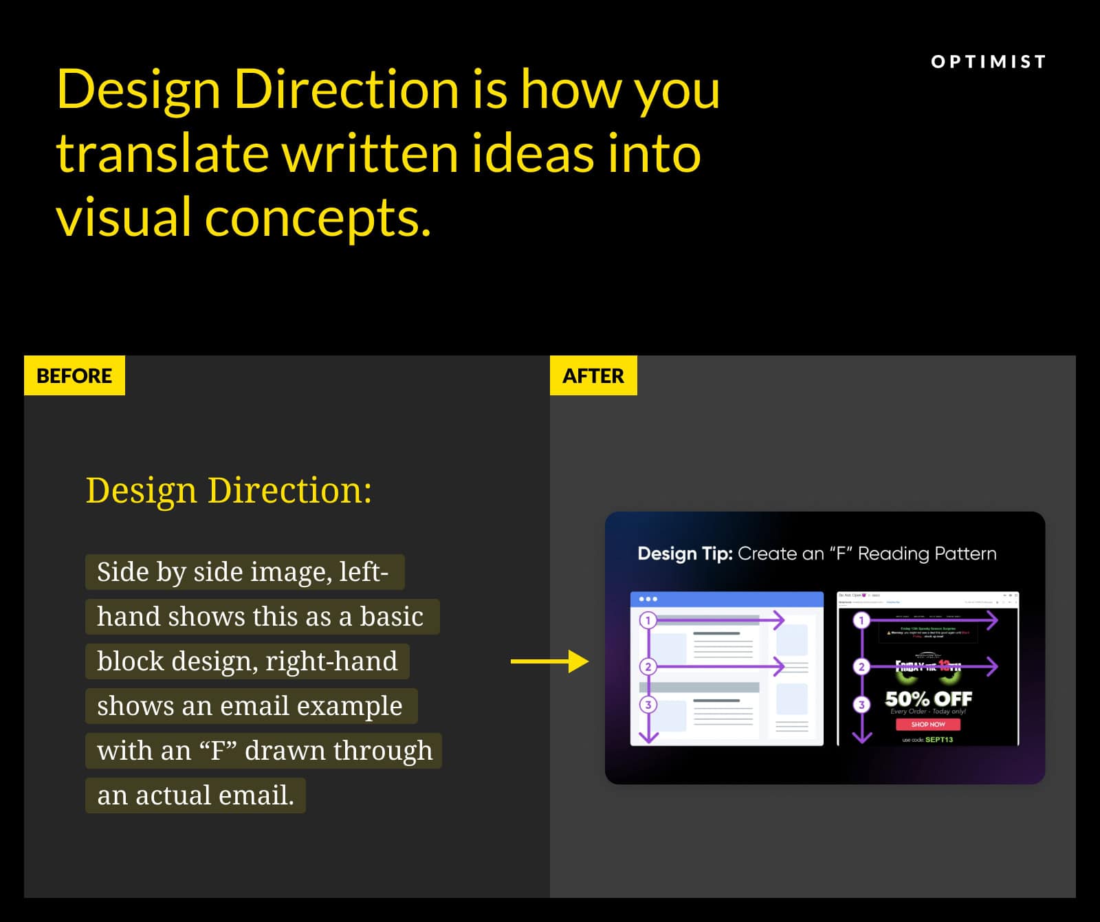
For the DreamHost post, we wanted to point out some of the key components that make up a real newsletter:
Call out a few of the elements identified in this newsletter, such as:
- Subject
- Newsletter title (Currents)
- Link to view in browser
- Attention-grabbing image
Notice how these instructions pointed to the intention of the design, rather than spelling out how to create the visual? We avoid being overly prescriptive with design direction, and allow our designers to use their domain expertise to find creative solutions.
Our visual coordinators also provide titles for every graphic, along with any relevant data points and links to sources.
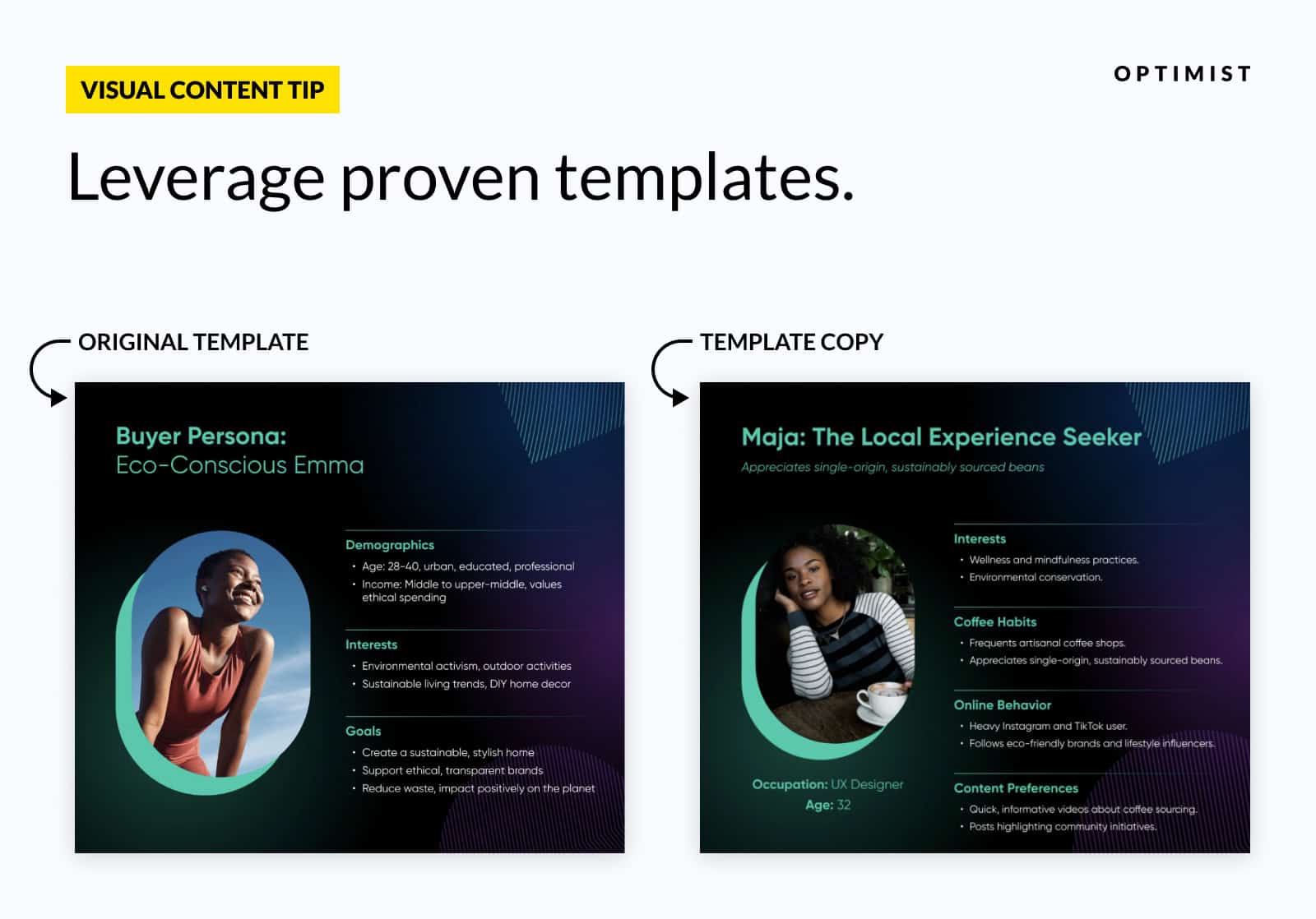
Recycling Where Appropriate
Reusing visuals is a valid play. It makes no sense to design a brand new infographic from scratch every time you mention a specific concept. That’s why we recycle visual content for our clients where appropriate.
But we do it very carefully.
Imagine you’re working on a topic cluster. It’d be tempting to reuse the same image across blog posts again and again. While this saves time, the constant repetition can make your content feel stale.
To avoid this issue, we:
- Only reuse up to 25% of client images.
- Tweak existing graphics every third re-publish (or so) to keep them fresh.
You can see a real-world example of thoughtful content recycling in two more posts we created for DreamHost.
In the first post, we designed a graphic that shows the kind of details that should be included in a buyer persona.
In the later post, we used that as a framework to create an example of a reader persona.
Step 4: Design Execution
The task of converting outlined ideas into polished visual content is assigned to our talented team of designers.
To maintain consistency across our design work, we agree on brand guidelines and technical specifications with each client. For DreamHost posts, our graphics are given near-black backgrounds, white writing, and elements in Azure blue and Prince purple — to match the company brand.
But client branding is just the beginning. The Optimist approach to design is shaped by wider research in marketing, design, and psychology.
Cognitive Load
If you scan through the images in this post, you’ll notice a trend: Simplicity.
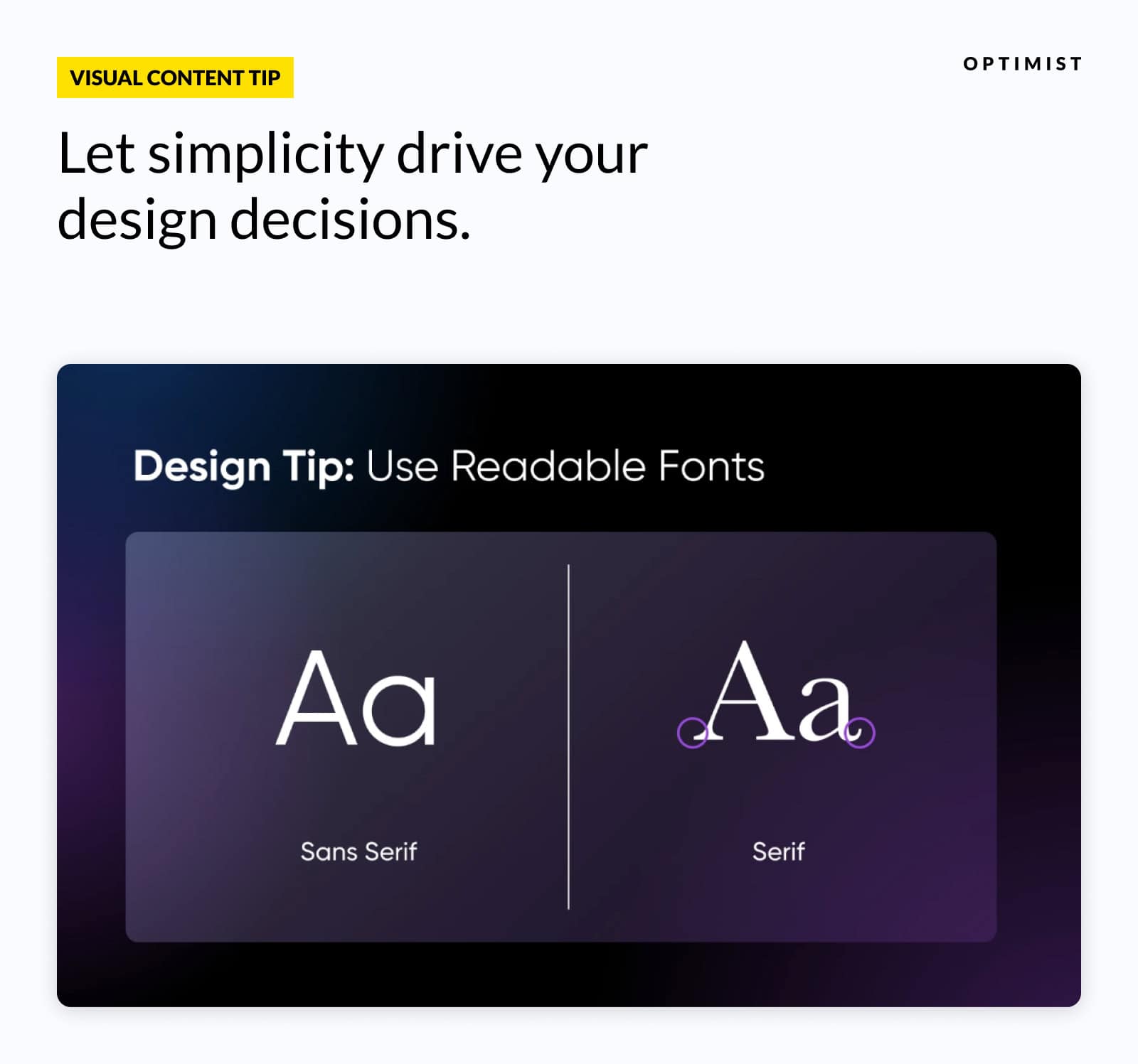
This design choice wasn’t (just) for the sake of minimal beauty. It’s rooted in science.
Cognitive load refers to the mental effort required to process visual information.
Research shows that reducing the amount of effort required to interpret visual content leads to better understanding and retention.
In the context of visual content, our designers apply this principle by:
- Removing unnecessary decorative elements.
- Using consistent visual styles.
- Making sure that every visual element serves a specific purpose in communicating the post’s message.
Sometimes, less really is more (engaging).
F-Pattern & Z-Pattern
Remember that graphic about F-patterns from the email design post? It illustrates a concept we use in our own work.
The F-shaped pattern describes how users typically scan content — in a horizontal movement across the top, then a second shorter horizontal movement lower down, and finally moving vertically down the left-hand edge of the page.
A common alternative is the Z-shaped pattern, where users look at each corner of the page before moving down.
We use these insights to build graphics that are easy to scan, and place them strategically within a web page.
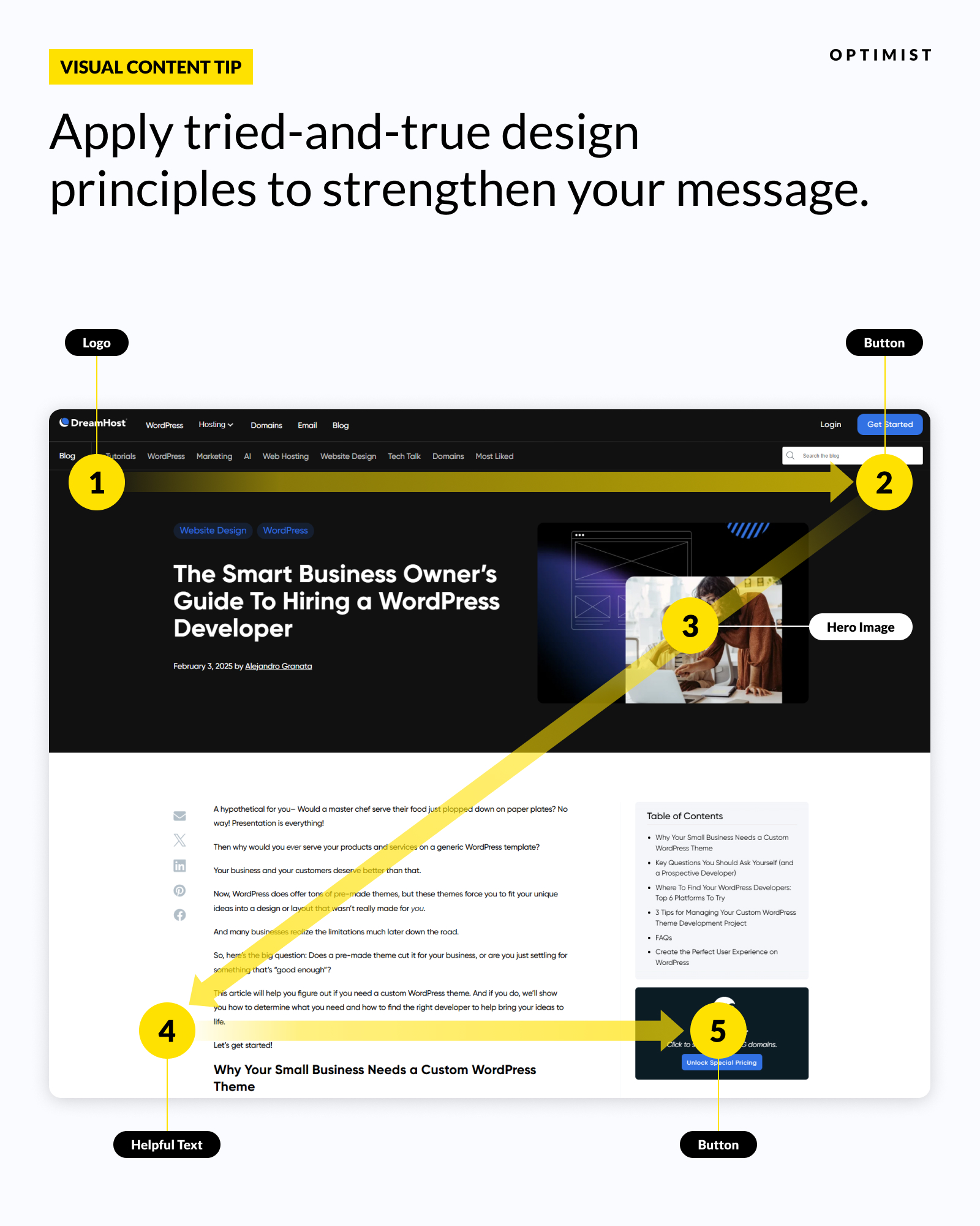
Visual Affordances
Visual affordances are design elements that guide user behavior via intuitive visual cues.
In the context of content, we use visual affordances to guide the eye. Take this example from the DreamHost email design post:
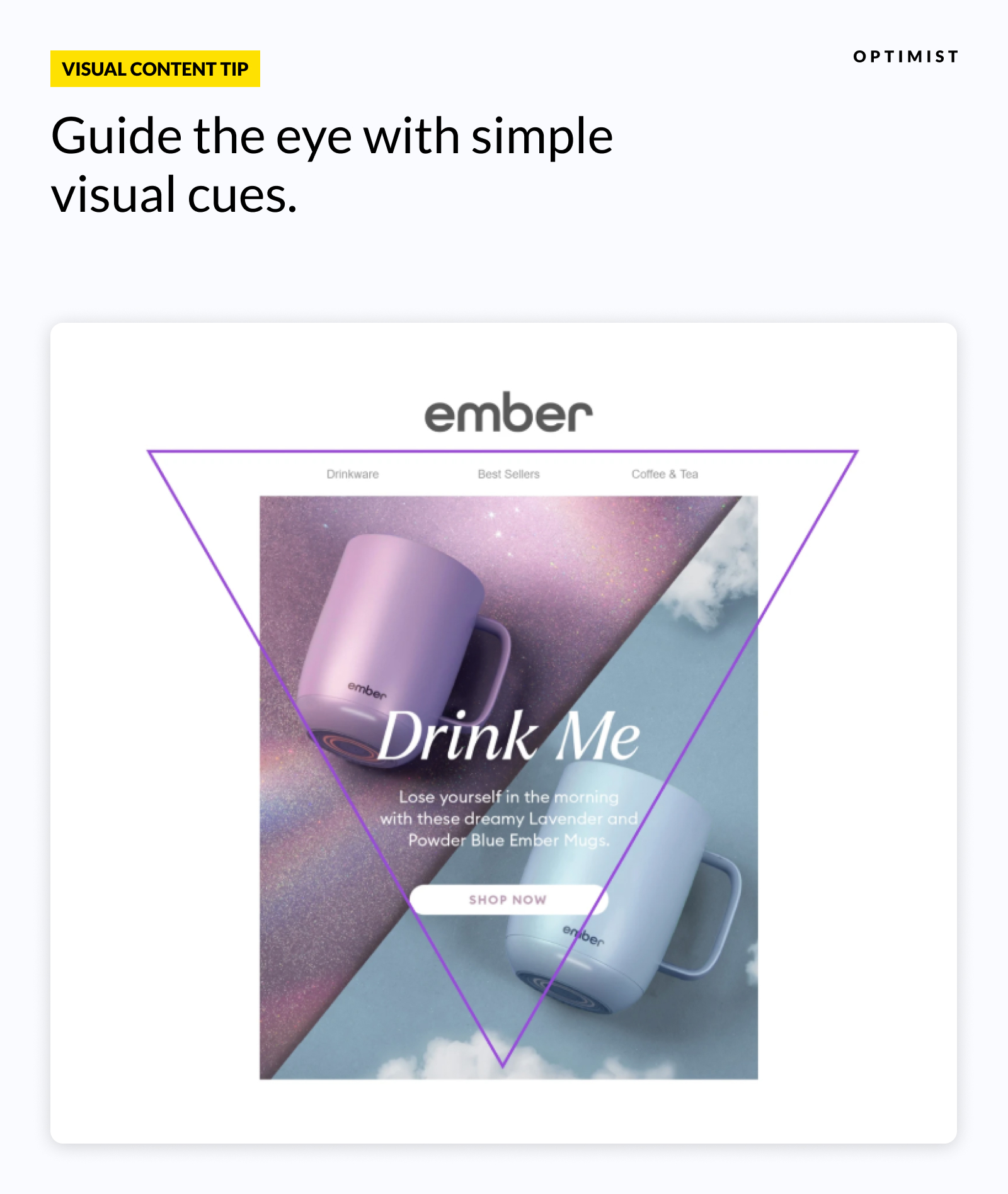
Notice that big purple triangle? Of course you did.
This addition to the screenshot guides your eye to the key content of the image. And you don’t need to know what an “inverted pyramid” is to understand the graphic.
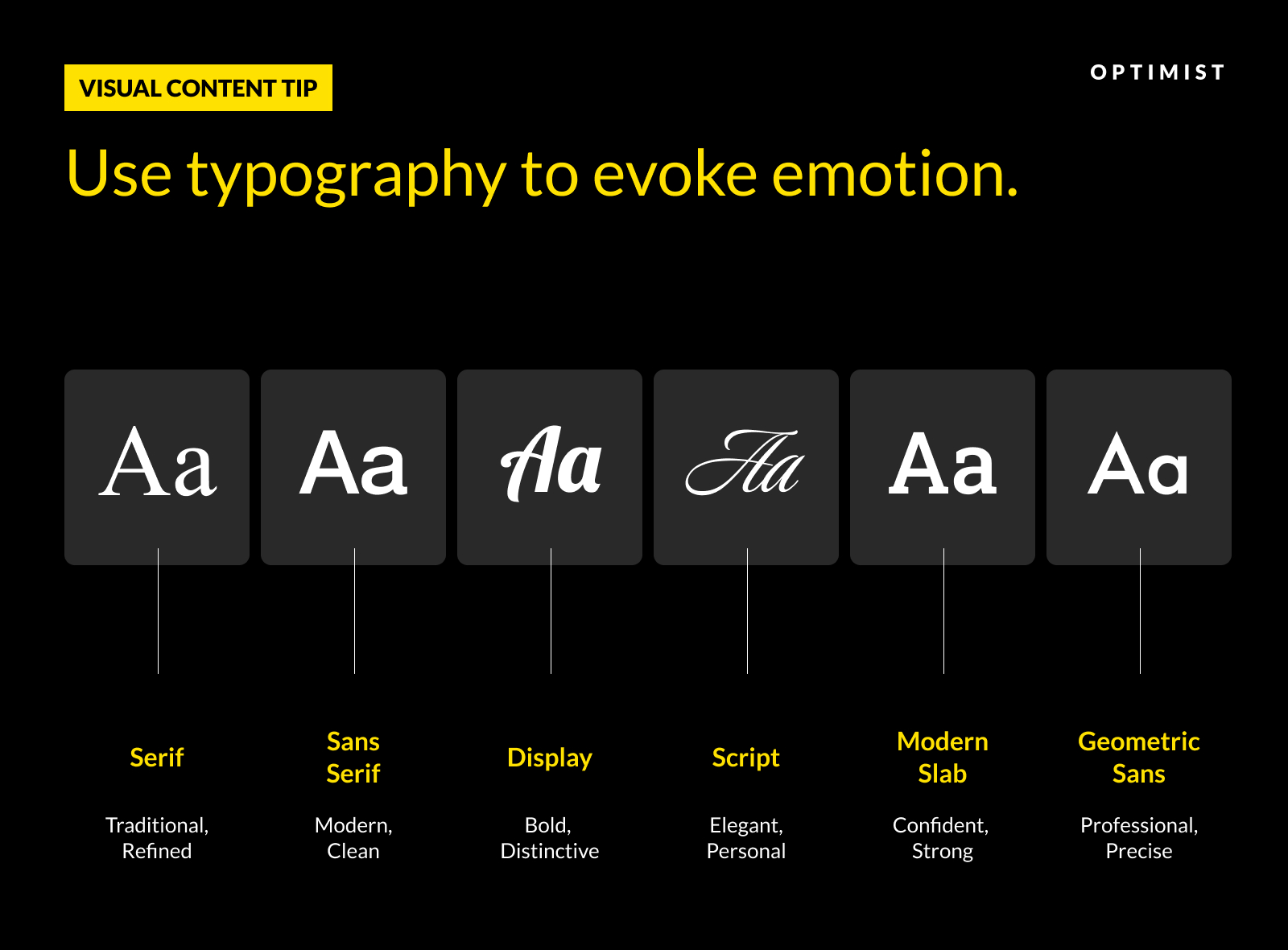
The Psychology of Colors and Fonts
You may not realize it, but colors and typography are powerful psychological tools. They can communicate mood, brand personality, and emotional tone even before the reader consciously registers it.
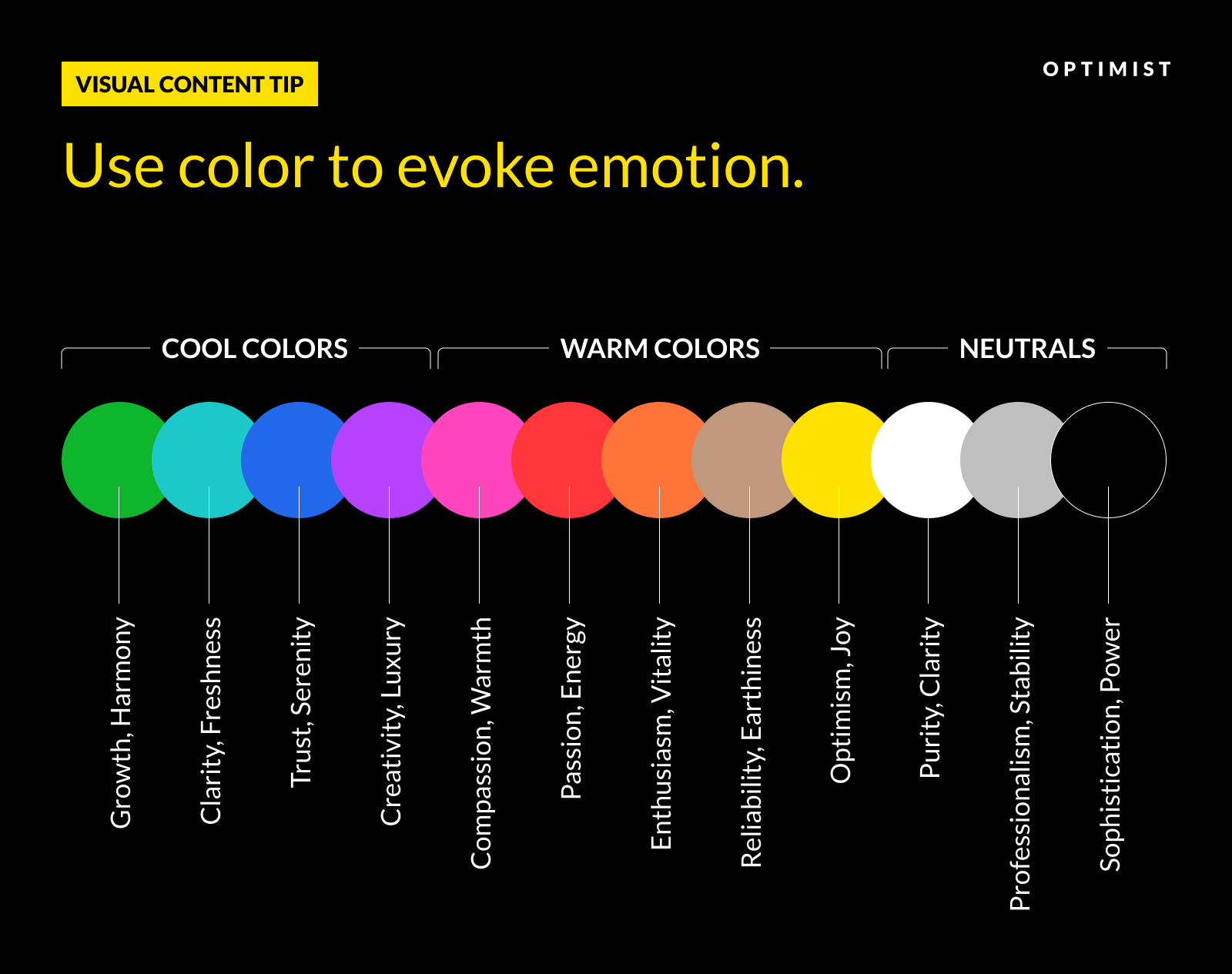
Science tells us that colors trigger specific emotional and physiological responses: Red can evoke urgency or passion, while blue suggests trust and professionalism.
Meanwhile, fonts can convey everything from academic authority (serif) to modern approachability (sans-serif).
At Optimist, our designers play with colors and fonts to find the right combination for each client’s audience.
Step 5: Reviewing & Making Tweaks
Once the designers complete their work, the finished designs are inserted into the written draft.
Before submitting designs to the client, we always run some final checks.
This means making sure the designs:
- Align with the original content brief.
- Meet the content goals.
- Match the brand and technical guidelines.
We also create accessible alt text for all images to make sure everyone, including those using screen readers, can understand our content.
If everything looks okay, the finished post — words and images — is submitted to the client for approval.
DreamHost was very happy with our email design post. It was published a few days later.
The Anatomy of Great Visual Content
The DreamHost blog post example reveals the ingredients of great visual content. The recipe combines psychological principles with practical design applications:
- The strategic placement of visuals every ~400 words takes account of cognitive load, preventing information fatigue while maintaining engagement.
- An emphasis on using real-world examples makes the content more relatable, giving readers something tangible to latch on to.
- Implementing F-shaped pattern principles and visual affordances within graphics helps to guide the attention of readers to key information.
- Consistent use of colors reinforces brand identity while enhancing readability.
While research-backed guidelines shape our work, the Optimist approach is also flexible. We allow our creative freelancers to use their professional judgment to find the best possible solutions for each project.
The end result is an engaging, visually appealing article that should impress DreamHost’s target audience.
Building a Visual Engine
While our work on this DreamHost post is done, the assets live on.
At Optimist, we regard visual content as an asset rather than expendable. Every design is custom-made for a specific purpose, but we aim to create graphics that also deliver long-term value.
This means our clients build up libraries of visual content, which they can draw on for later projects.
In another post for DreamHost, we delivered visual content on the topic of Google algorithm updates.
Many of the explainer graphics from the piece were later reused as social content on DreamHost’s Instagram account — in turn, driving more visitors toward the original written piece.
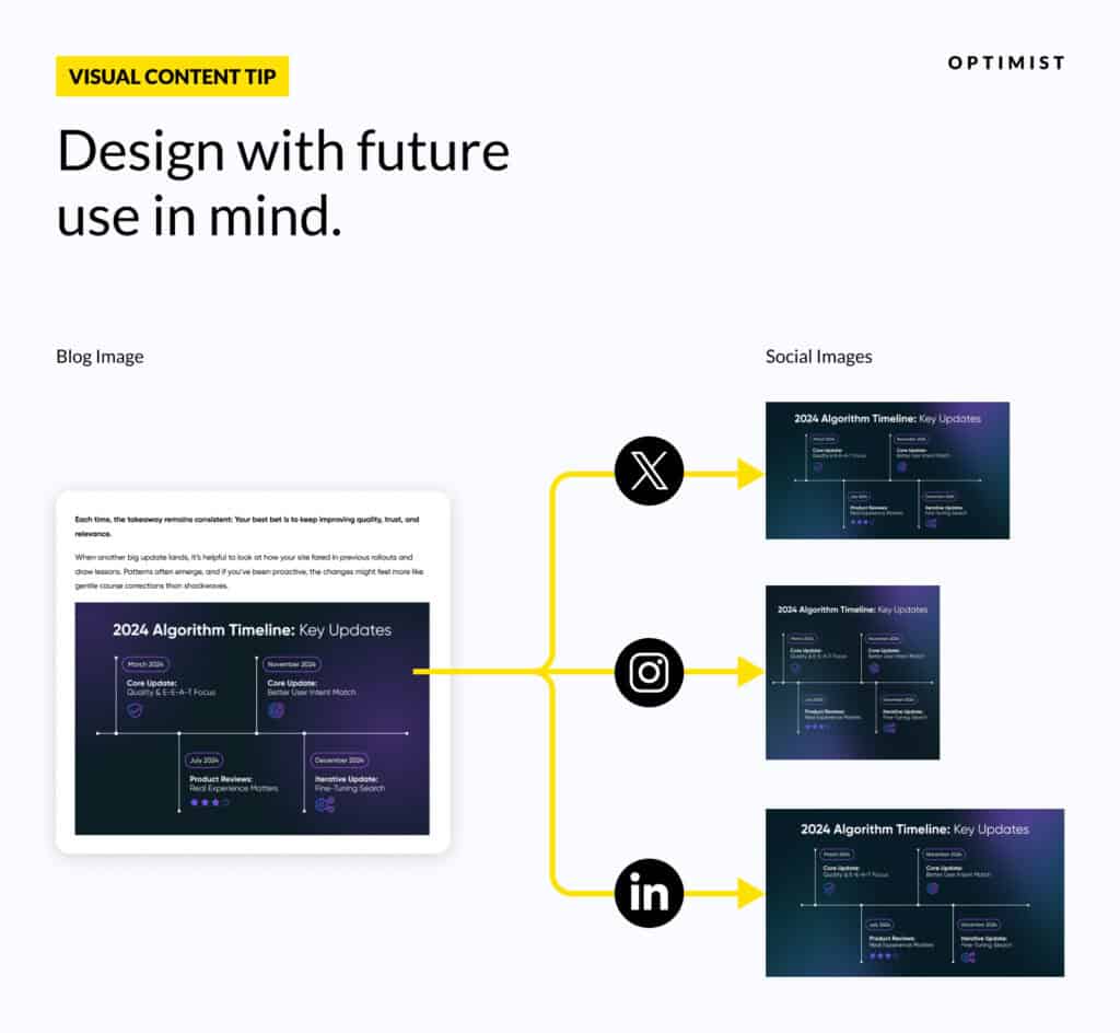
Assets like these are designed to be used across multiple channels, including Instagram, LinkedIn, X, Facebook, and Reddit.
They can also be repurposed into short-form videos for Reels and TikTok, and worked into newsletters, lead magnets, reports, and case studies.
For busy marketing teams on the content treadmill, this is a cheat code.
Instead of splitting precious resources between dozens (or hundreds) of channels, our clients can simply draw visual content from an always-full reservoir. That means more time and money to spend on other marketing tasks.
Ready To Inject Energy Into Your Visuals?
Your customers are swimming in pretty pictures. But are those images actually delivering any value?
Visual content should help your leads to achieve their goals while reinforcing your brand. The purpose of every image should be clear without context, and your designs should deliver value wherever they’re posted.
The best visual content is also reusable. There’s no reason why graphics from your blog posts can’t become viral social media posts, and vice versa.
In business terms, that means more clicks and conversions.
To unlock these benefits, it’s vital to have a process that produces consistent results. This is particularly important if you want to build a library of reusable assets.
What if you don’t have the resources to do it all yourself?
We provide the talent, flexibility, and scale that marketing managers need to make their content strategies really work.
Take the first step toward transforming your visual content game by scheduling a strategy call with us today.
—
Initial outline and draft by Tina Harris.
Visual direction and content ops by Katy Flatt.
Editing by Brinda Gulati.
Design by Derrick Sun.
Content production by Rizky Darmawan.
🫶
